Magazine Advert For Digipak
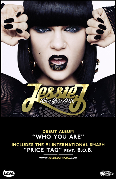
She is also staring directly at the reader which captivates and grabs the attention of the audience. The test uses colours that are in strong contrast to the abundant black (white and gold). This makes the title of the album and the artist's name stand out as well as show off her love for jewellery and "bling".
The alignment of the text is centred to make it the centre of our attention, just like Jessie J.
No comments:
Post a Comment
Note: only a member of this blog may post a comment.